News - 4 February 2015
New Clei logo: A symbol of innovation
1. Hot and new
Time for a brand new logo for the Clei company. An important event for any business, especially when the company - like Clei – is committed to both design and technological innovation.
2. Logos: why are they so important?
“In the language of advertising, a logotype is a specific graphical representation of the name of a company or product, usually also synonymous with its trademark. It is often abbreviated to logo”.
The logotype is undoubtedly the most important and distinctive symbol of the identity of a brand or company. The creation of a logo requires particular attention and effort because, aside from the technical considerations regarding its legibility and reproducibility, it ends up becoming the hallmark of the company, the symbol that embodies its nature and character. Like all cultural inventions, the logo not only reflects the nature of the Company, but also the taste and times of its creation; otherwise the logo would not achieve its vectorial function as a visual communicator. As such, as times, tastes and the collective sensibility change, it is only natural to modify the “genetic” elements of the symbol, in accordance with ever-changing development needs.
3. The Clei identity
Clei is a company that knows how to strike the right balance, a business which has found its competitive raison d'être in applied technological research, and its mission in conceiving, designing and producing transformable furniture systems that increase space through functional metamorphosis. Products that must be perfectly safe, while matching the aesthetic trends of contemporary international taste. The new logo had to reflect all of this: the essence of a company whose most distinctive trait is its commitment to research, innovation and change.
4. Graphical intervention: a conceptual reflection
According to a well-known principle of dialectics, “Quantitative change leads to qualitative change and vice versa”. This functions perfectly when applied to chemistry and physics, but what about graphics?
Every graphical intervention has repercussions in terms of visual perception that generate complex psychological and emotional reactions in our minds. A profound relationship is created between symbol and meaning, that leads us to regard “that” symbol, rather than any other, as particularly suitable for expressing a feeling, a cultural atmosphere, an identity in terms of values.
In the case of Clei, graphic research was aimed to make the logo reflect the spirit of the time, while highlighting the original values of the brand, a historic presence in the design technology world.
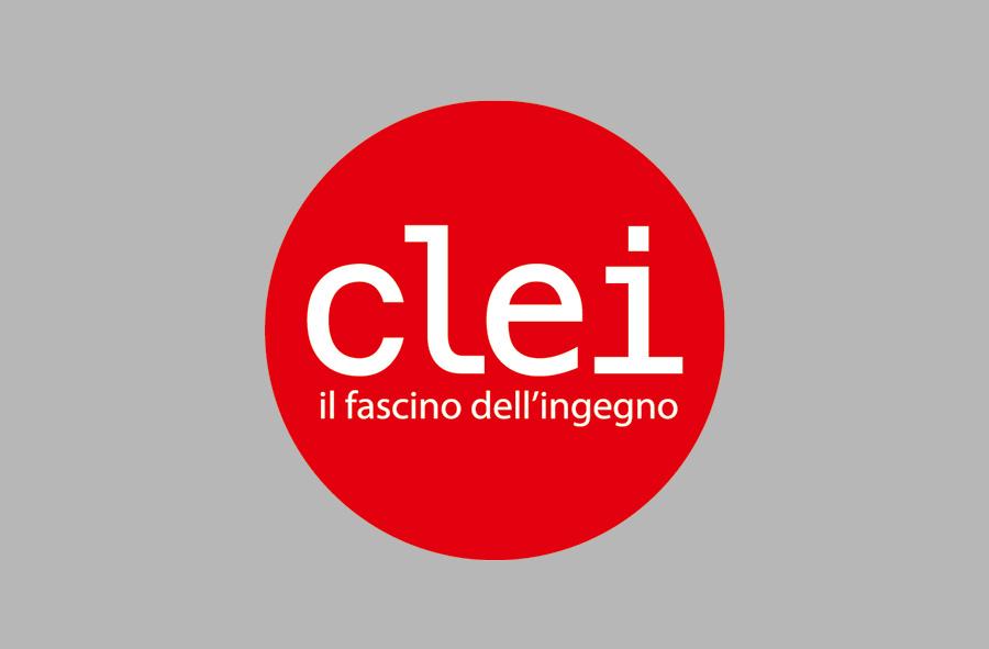
A serif typeface was chosen by processing the Menlo semi bold font. The use of serifs gives the composition a harmonious feel while the choice of font is consistent with the expressive languages of the design world.
The result guarantees excellent legibility in all usage conditions, from positive to negative; it will be inserted in a circle to give it more character and build brand-awareness.
Last but not least, the choice of colour. The red colour code (Pantone 485) conveys passion, strength, courage: values that are perfectly in sync with the mission of the Clei brand.